
Logo for Holographic Paper company
Logo design revamp contest at 99designs
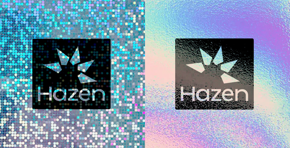
This logo was designed as a refined evolution of Hazen’s original star emblem, created for a company specializing in holographic stickers. The new symbol retains the essence of a star while introducing a more abstract, layered geometry that reflects the multi-faceted nature of holographic paper—its ability to refract light, shift color, and evoke dimensionality.
The five triangular shapes suggest both radiance and repetition, echoing how holographic surfaces reflect light in multiple directions. Simultaneously, the layered structure evokes sheets of paper, nodding to the materiality of the product itself. This dual symbolism bridges visual impact and tactile reality, grounding the brand in both concept and craft.
Designed with scalability in mind, the logo maintains clarity and recognizability even at small print sizes, ensuring it performs well across packaging, stickers, and digital platforms. The final composition balances minimalism and complexity, offering a contemporary identity that honors Hazen’s legacy while embracing its innovative spirit.