This packaging design series was developed across multiple stages of a 99designs contest, with each proposal evolving in response to client feedback. The visual direction explores tropical serenity and botanical clarity, blending calming color palettes, natural textures, and clean typography to reflect the brand’s promise: “Find your calm, naturally.” From initial concepts to refined iterations, the designs aim to balance emotional resonance with shelf impact, offering a versatile identity for this non-alcoholic kava elixir.

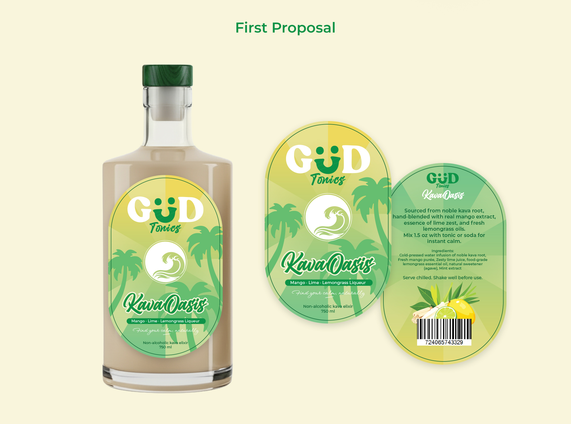
Before receiving any client feedback, I explored a dual‑label concept to enhance transparency and showcase the liquid’s natural color. The front label introduced the tropical theme, while the back label carried the product story and imagery. This version received positive feedback (4 stars) for its clarity and shelf appeal.
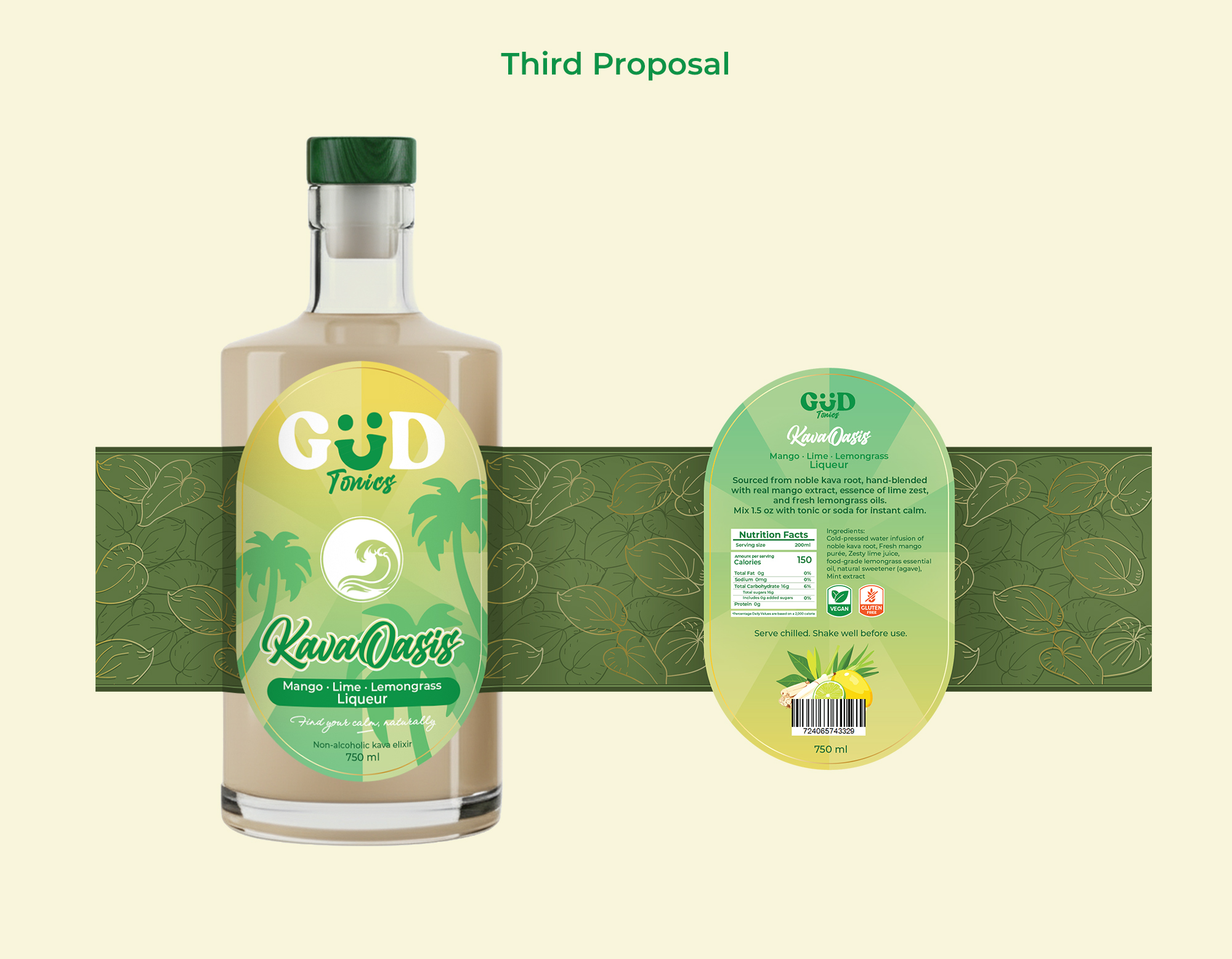
Following the client’s request for a single wrap‑around label, I redesigned the layout into a clean rectangular format. In this stage, I also introduced several elements that were not requested but strategically valuable, such as a a gluten‑free badge, a vegan badge, a clear ingredient list and nutrition facts panel.
These additions anticipate consumer expectations and potential future client requests, while strengthening trust and purchase motivation through transparency.

In this final iteration, I created a custom kava leaf pattern with subtle gold reflections. This design allowed for partial transparency, offering a glimpse of the liquid while deepening the botanical aesthetic. It balanced visual richness with functional clarity, aligning with the brand’s calming, natural positioning.
Disclaimer: All visuals presented in this case study were created specifically for a 99designs contest. The GUD Tonics logo was provided by the client and is not my creation. These designs represent my proposal within the contest context and are not part of GUD Tonics’ official packaging.