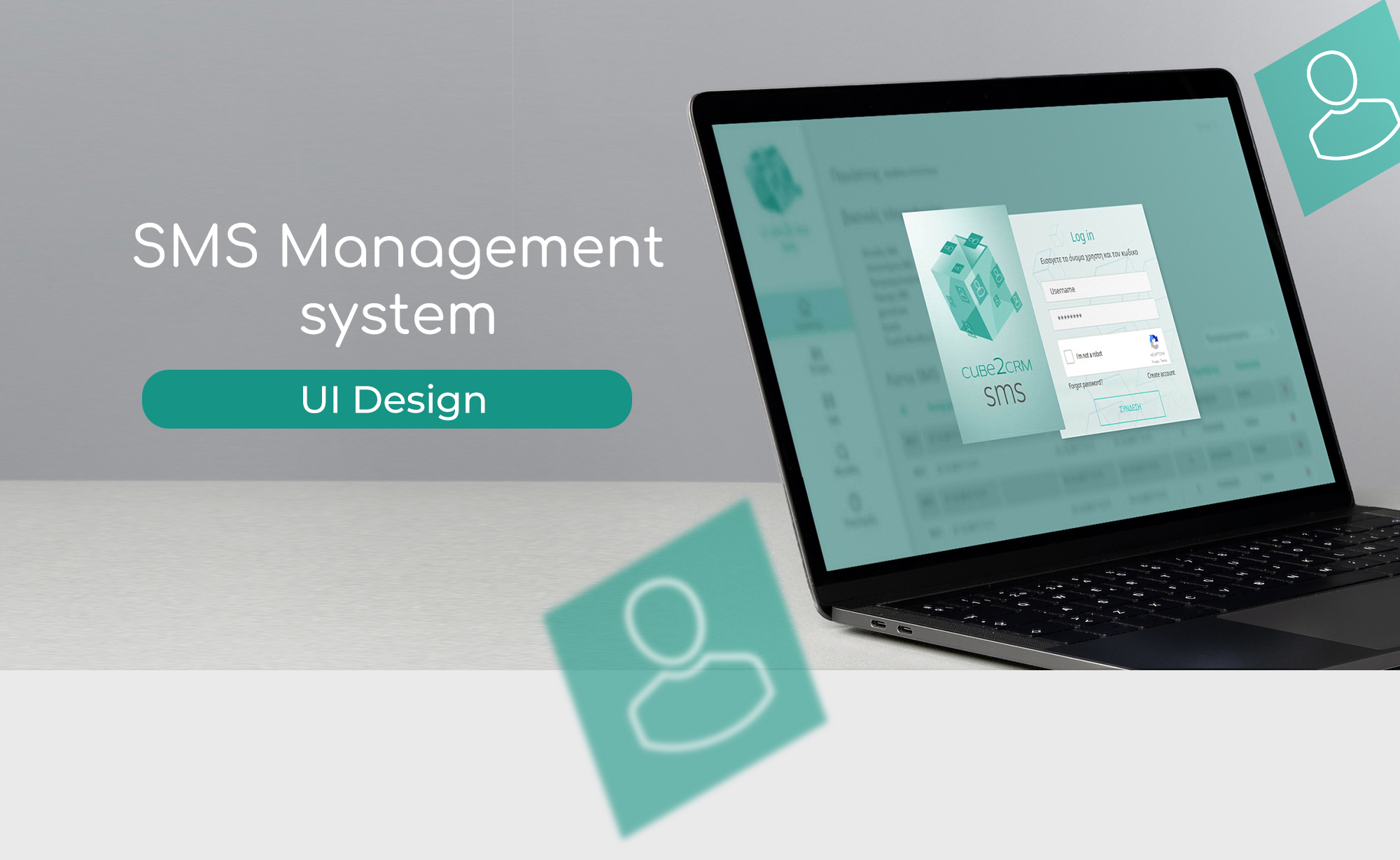
This UI project was developed for a private client, focused on building a visual identity and interface for an SMS management system. Although the scope was limited to three screens — login, dashboard, and contact list — I expanded the presentation to include a flow chart that illustrates how these components fit into the broader user journey. This was not requested, but reflects my approach to design as a system, not just a set of screens.
I created the logo, selected the typographic system and color palette, and designed custom icons to support clarity and consistency. Each screen was crafted to balance technical functionality with visual accessibility, ensuring that users could navigate the system intuitively, even in a dense data environment.
Beyond the requested elements, I introduced a flow chart to visualize the user journey and decision points. This helps contextualize the interface and demonstrates how each screen supports specific user goals. It also reflects my ability to anticipate structure and logic, even when working with partial information.
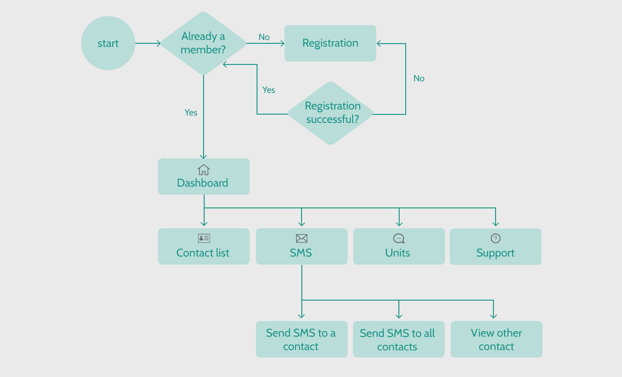
This partial flow chart was created to provide context for the delivered screens and to predict how the product could evolve. It represents the core logic of the system, with the understanding that additional paths and features would be mapped if the project expanded..
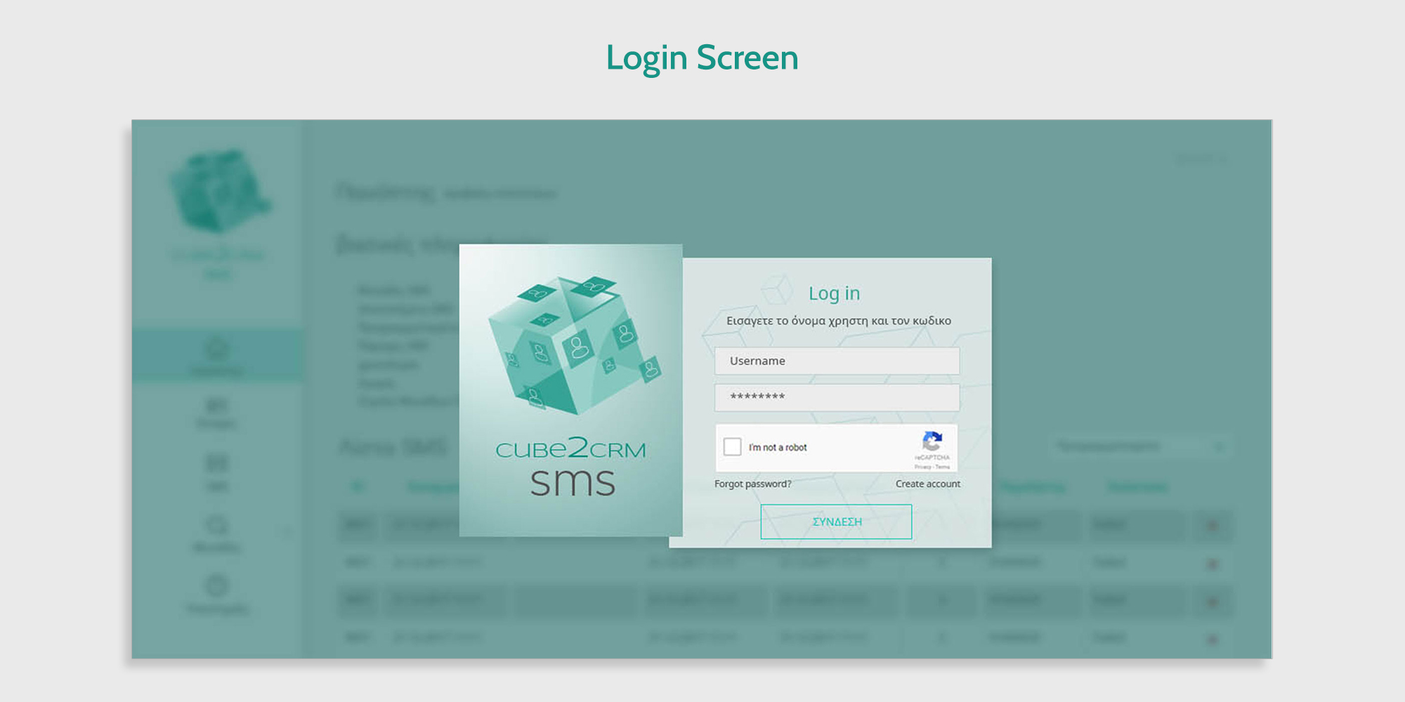
A clean, accessible entry point for the system. I designed this screen to prioritize clarity and trust, using simple fields, CAPTCHA verification, and clear call-to-action buttons. The interface supports both new and returning users.
I designed the login screen with a blurred background and a subtle blue filter to gently hint at the interface the user will see after logging in. This approach creates visual continuity, sets the tone for the system, and helps the user transition smoothly into the dashboard environment.
I designed the login screen with a blurred background and a subtle blue filter to gently hint at the interface the user will see after logging in. This approach creates visual continuity, sets the tone for the system, and helps the user transition smoothly into the dashboard environment.
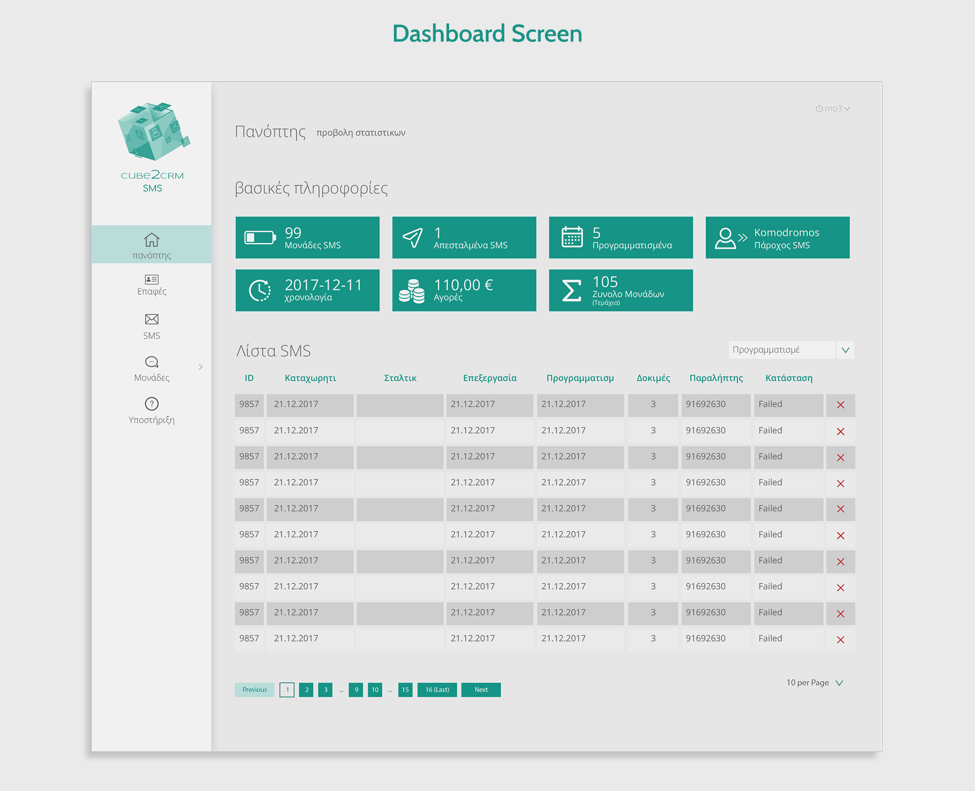
This screen centralizes key statistics and SMS activity. I focused on visual hierarchy and legibility, ensuring that users can quickly scan metrics, track message status, and navigate to core functions. Icons and spacing were designed to reduce cognitive load.
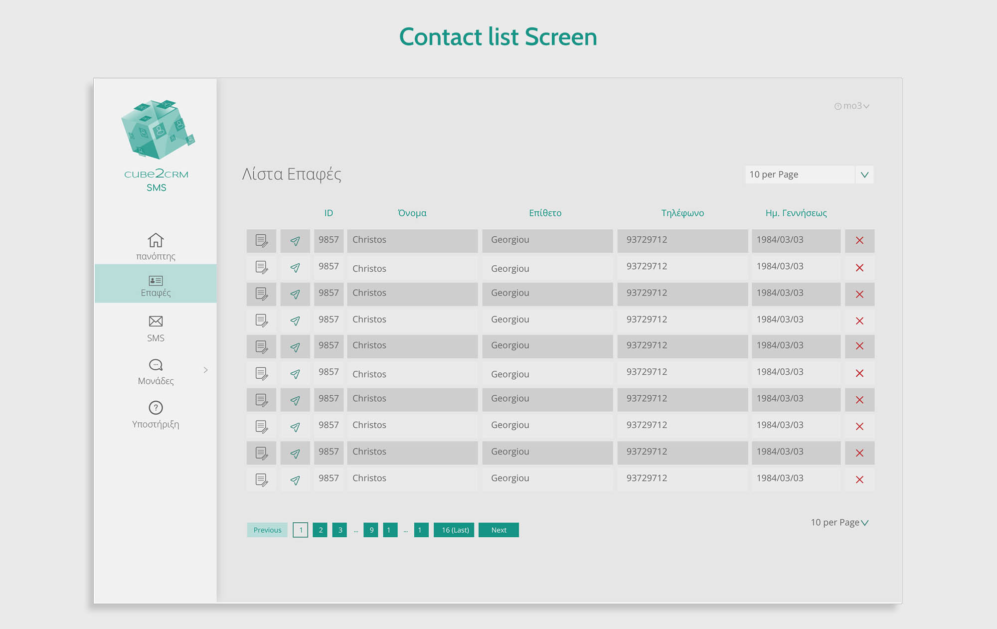
A structured view of user contacts, optimized for quick reference and action. I designed this layout to support bulk operations and individual edits, with clear labeling and intuitive controls. The typography and spacing reinforce clarity in a data-heavy environment.
Disclaimer: This project was created for a private client and reflects only the portion of the system I was commissioned to design. The flow chart and contextual elements were developed independently to illustrate how the delivered screens fit within the broader product experience.