Case Study: RenataRafaella.com — Portfolio as Product
Designing a responsive, emotionally intelligent portfolio that reflects strategic UX/UI thinking and personal clarity.
My personal website began as a creative archive — a place where I collected years of work across design, art, video, and research. The original version was created eight years ago, at a time when my focus was primarily on visual expression rather than structured UX thinking. Over time, through checking the user flows on my website through Statcounter, I noticed a pattern: users were landing on the homepage but not exploring anything beyond it. The interface was visually expressive but cognitively ambiguous, with too many buttons and unconventional labels that didn’t guide visitors toward the rest of the content. This redesign became an opportunity to bring my current UX/UI maturity into a space that represents me.
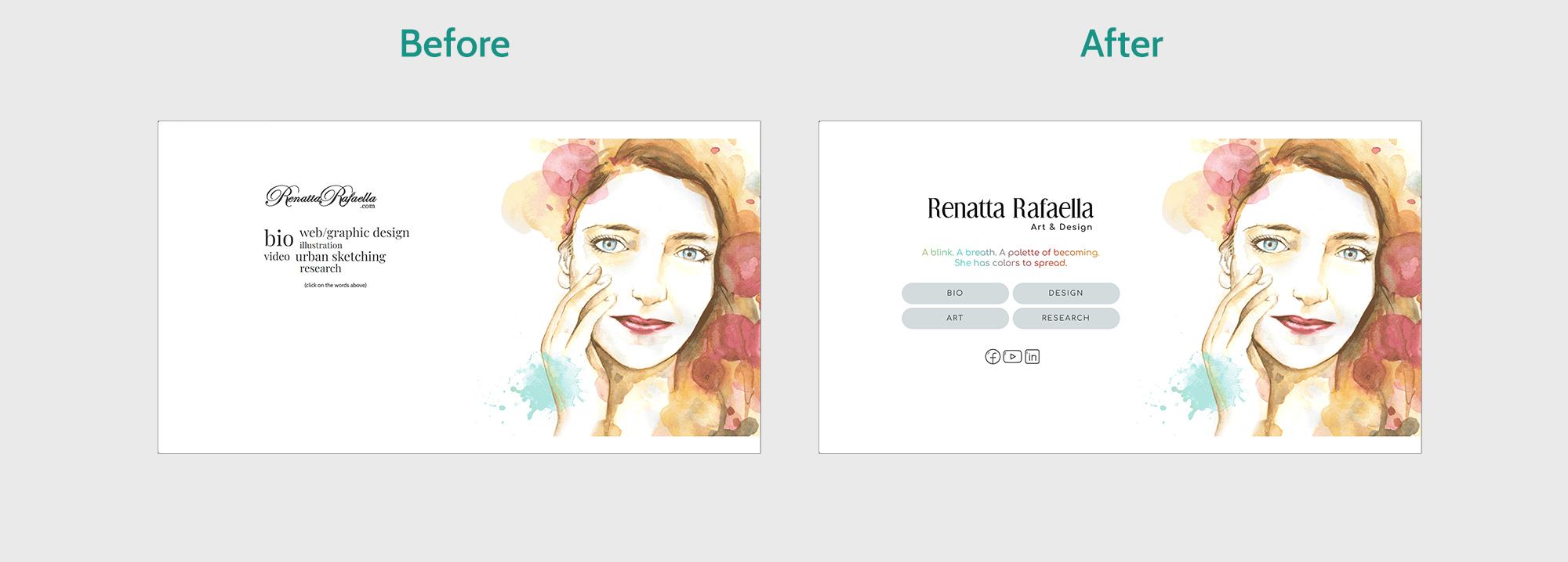
The first step was simplifying the homepage. I reduced the number of buttons and renamed the categories using familiar, recognizable labels that help users understand where each path leads. The animated watercolor portrait remained at the center of the experience — it captures my energy and presence in a way no static layout could — but the surrounding structure became more intentional and intuitive.
I also reframed the introductory text to communicate clarity, confidence, and emotional resonance.
With the homepage clarified, I focused on ensuring the experience worked seamlessly across devices. The previous version was responsive, but the layout lacked rhythm and hierarchy. I refined the structure so that the homepage and navigation feel consistent and accessible whether viewed on desktop, tablet, or mobile. This was essential for a portfolio that needs to support quick scanning and deeper exploration.
With the homepage clarified, I focused on ensuring the experience worked seamlessly across devices. The previous version was responsive, but the layout lacked rhythm and hierarchy. I refined the structure so that the homepage and navigation feel consistent and accessible whether viewed on desktop, tablet, or mobile. This was essential for a portfolio that needs to support quick scanning and deeper exploration.
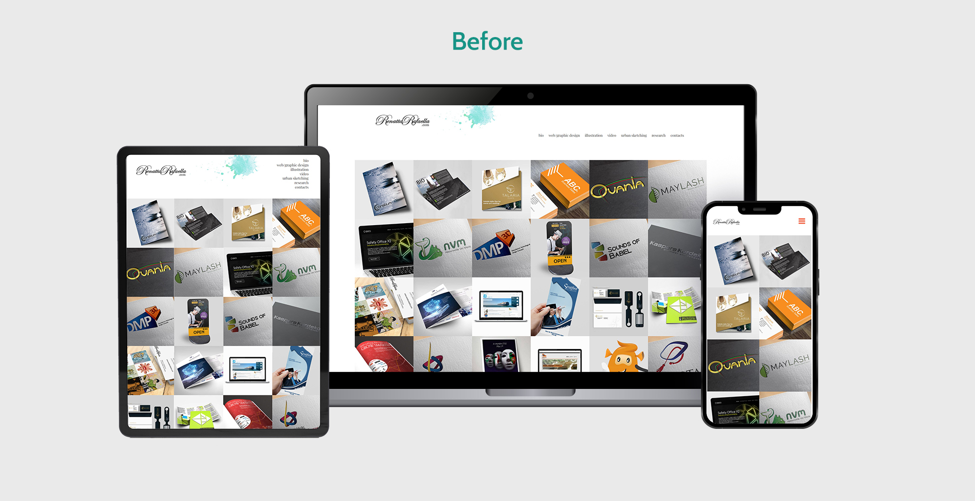
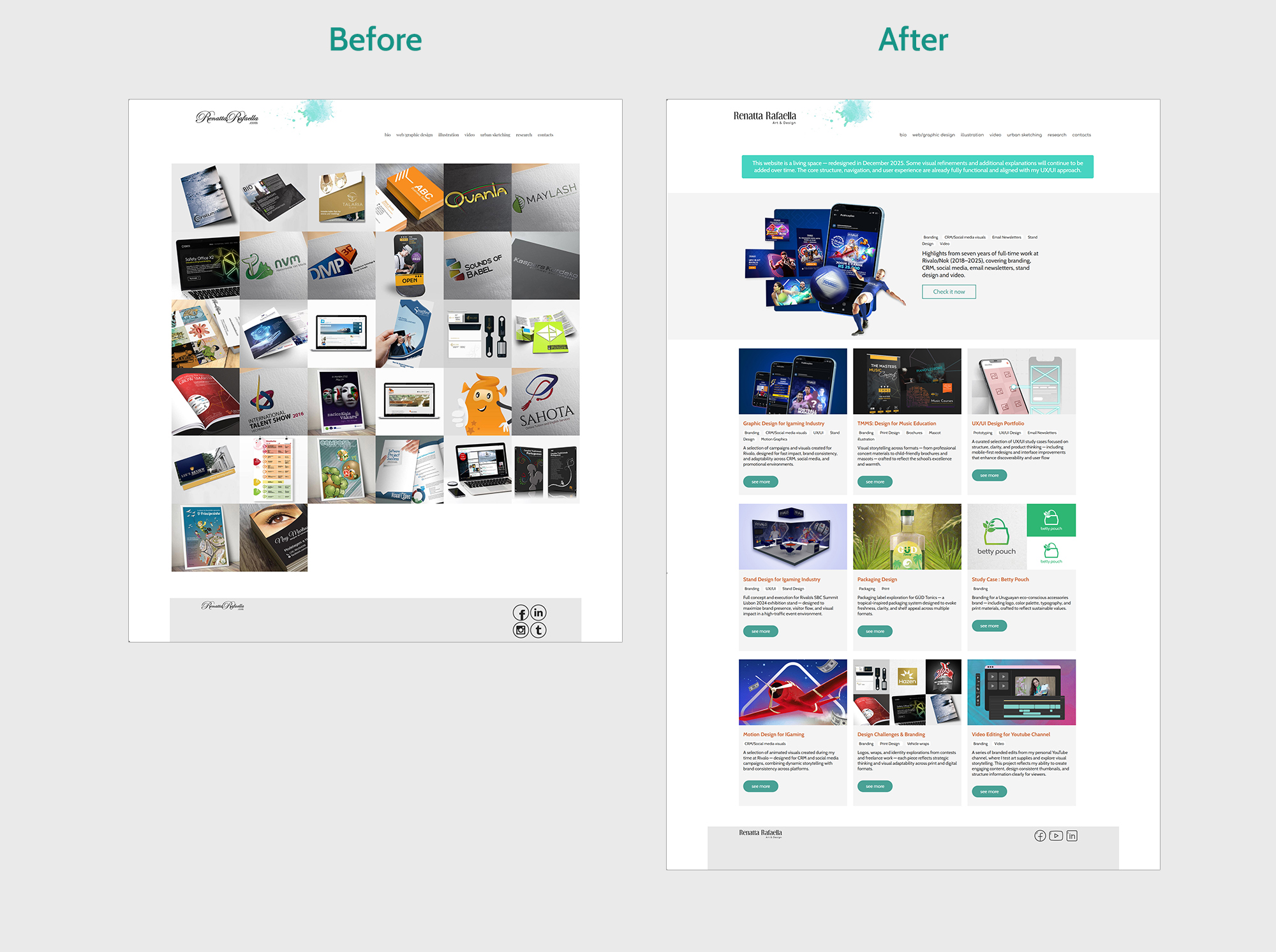
Inside the Design page, I introduced two important structural elements before the grid. The first is a transparent note explaining that the website is a living space — redesigned recently and still evolving. This sets expectations, communicates honesty, and reflects my UX values of clarity and transparency.
Right below that, I added a new section dedicated to highlighting the work I did during my previous full‑time experience. This was a deliberate choice: many users arrive at a portfolio looking for the most substantial, professional work first. By placing this section at the top, I guide visitors toward the projects that best represent my long-term experience, impact, and design maturity. It also creates a smoother narrative transition into the rest of the portfolio.
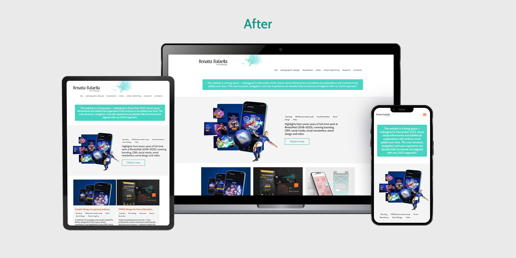
Only after this contextual introduction does the new grid system appear. The previous layout was dense and inconsistent, making it difficult for users to scan or understand the hierarchy of content. The redesigned grid is modular and responsive — 3×3 on desktop, 2×2 on tablet, and 1×1 on mobile — bringing clarity, rhythm, and accessibility to the experience.
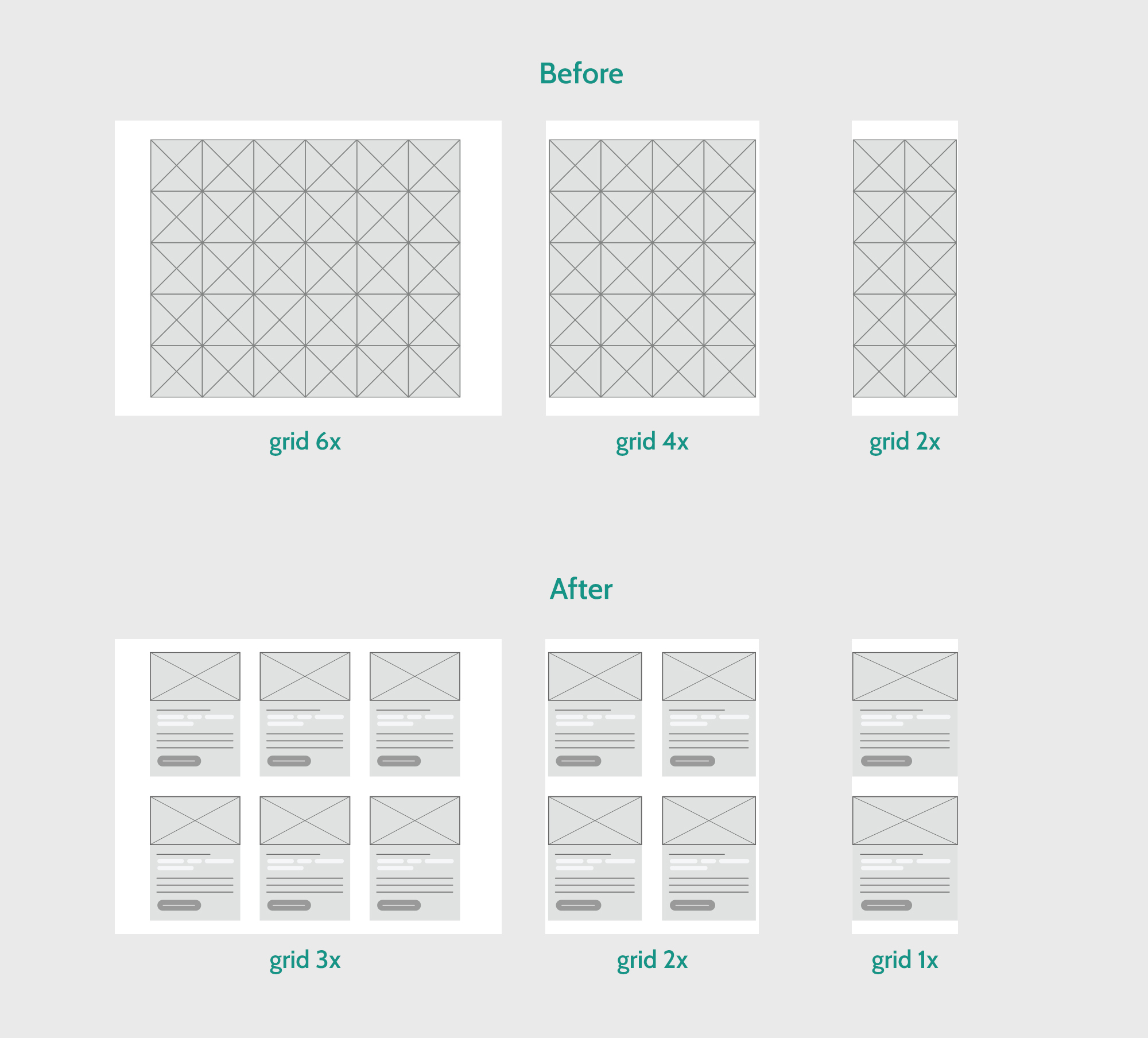
The grid redesign was one of the most impactful changes. The previous layout relied heavily on hover interactions to reveal project descriptions — a pattern that simply doesn’t translate to mobile or tablet. This meant that a large portion of users were unable to see essential information unless they clicked blindly into each project. The thumbnails were also small and visually compressed, limiting the expressive quality of the animated images I created.
The new grid system solves these issues by allowing larger thumbnails, visible descriptions, and clear calls to action without relying on hover. The modular structure adapts across breakpoints — 3×3 on desktop, 2×2 on tablet, and 1×1 on mobile — creating a consistent, accessible experience for all users. This shift not only improves usability but also supports a more intentional visual rhythm and hierarchy, making the portfolio easier to scan and more inviting to explore.
The final stage of the redesign focused on restructuring the project pages themselves. I replaced the scattered, visually heavy layout with a more organized system that highlights each project with a thumbnail, a short description, and a clear call to action. This structure supports both creative and product‑oriented work, making the portfolio easier to navigate and more aligned with how hiring teams evaluate designers.
Technically, the redesign was implemented using HTML and CSS, with layout logic explored in Illustrator before moving into code. I focused on performance, readability, and future scalability, leaving space for additional UX/UI explanations that I plan to integrate over time.
The outcome is a website that finally reflects who I am today. Users navigate more easily, engagement extends beyond the homepage, and the structure supports both my creative and product‑focused work. More importantly, the redesign helped me clarify my own narrative. My portfolio is no longer just a gallery of projects; it is a product — responsive, intentional, and emotionally intelligent.
Disclaimer: This case study documents the redesign of my personal website as of its latest release. Because the site is an active product, ongoing improvements may be introduced over time, including additional prototypes, visual refinements, and expanded UX documentation. All insights and decisions presented here correspond to the version evaluated during this study.